Um ano atrás, Yan Holtz publicou o texto What’s wrong with pie charts?. Resolvi reproduzir uma parte dele aqui, aquela que consiero mais importante, para deixar esta ideia mais acessível para brasileiros.
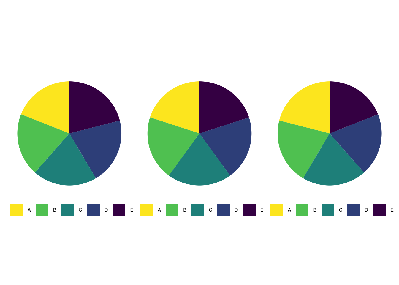
Por exemplo, veja os gráficos abaixo. É possível perceber algum padrão? Em caso afirmativo, qual?
E se mudarmos a visualização para barras? Será que o padrão ficou mais claro?
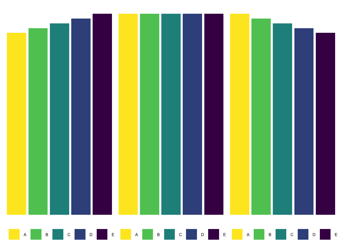
Com o gráfico de barras, fica claro o padrão emerge a partir destes gráficos. É muito mais fácil para nós humanos compararmos comprimentos (como barras) do que áreas (como fatias de pizza).
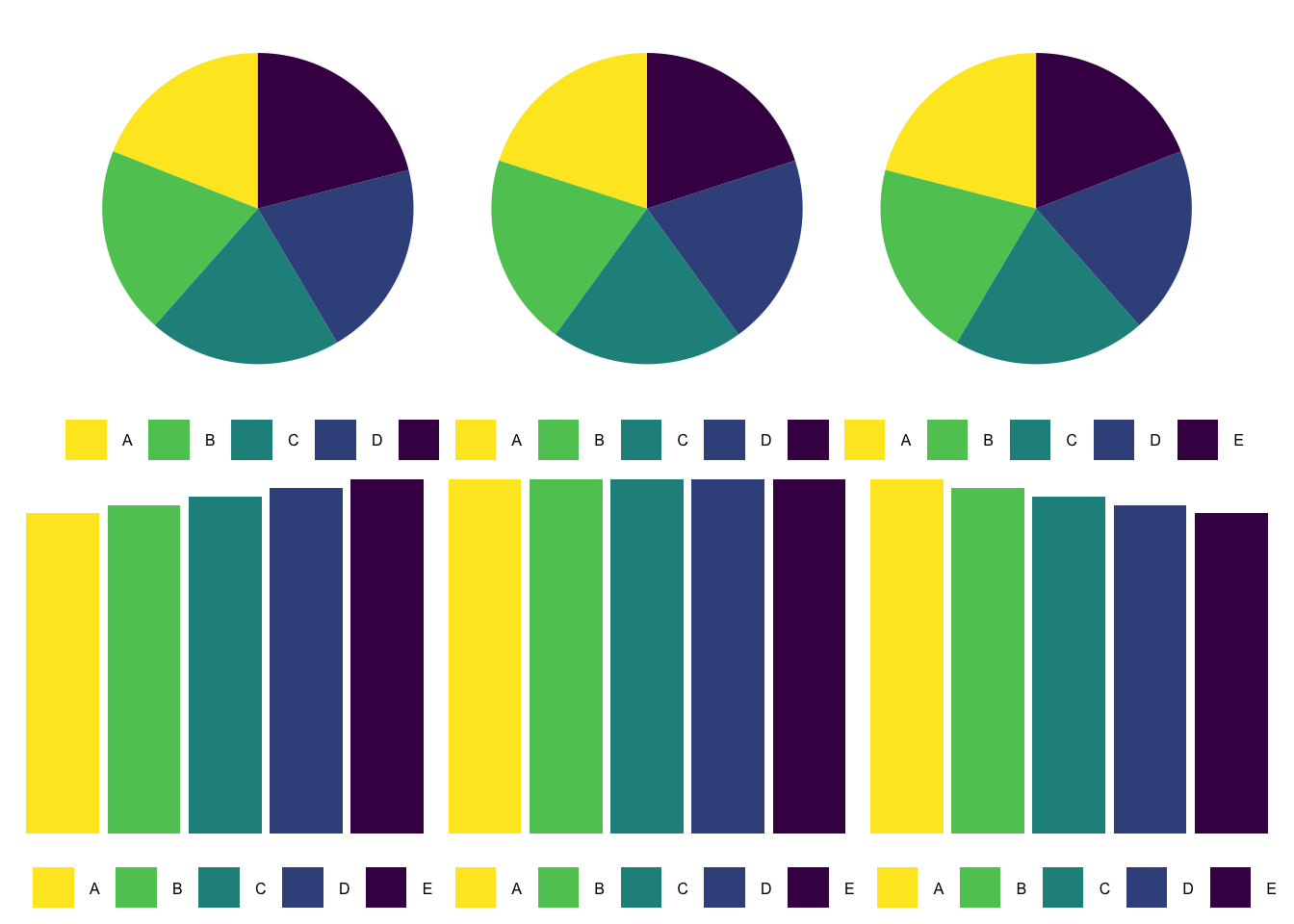
Abaixo os gráficos são comparados uns em cima dos outros para que a comparação entre eles fique ainda mais óbvia.
Abaixo está o código para reproduzir os gráficos vistos neste post.
library(tidyverse)
library(patchwork)


k <- 1

dados_crescentes <-
  data.frame(categoria = LETTERS[1:5],
             valor     = rep(20, 5) + seq(-k, k, length.out = 5))

dados_iguais <-
  data.frame(categoria = LETTERS[1:5],
             valor     = 20)

dados_decrescentes <-
  data.frame(categoria = LETTERS[1:5],
             valor     = rep(20, 5) + seq(k, -k, length.out = 5))

g1 <-
  ggplot(dados_crescentes, aes(x = "categoria", y = valor, fill = categoria)) +
  geom_col() +
  coord_polar(theta = "y") +
  scale_y_continuous(breaks = NULL) +
  theme_void() +
  scale_fill_viridis_d(direction = -1) +
  labs(fill = "") +
  theme(legend.position = "bottom",
        legend.text = element_text(size = 6))

g2 <-
  ggplot(dados_iguais, aes(x = "categoria", y = valor, fill = categoria)) +
  geom_col() +
  coord_polar(theta = "y") +
  scale_y_continuous(breaks = NULL) +
  theme_void() +
  scale_fill_viridis_d(direction = -1) +
  labs(fill = "") +
  theme(legend.position = "bottom",
        legend.text = element_text(size = 6))

g3 <-
  ggplot(dados_decrescentes, aes(x = "categoria", y = valor, fill = categoria)) +
  geom_col() +
  coord_polar(theta = "y") +
  scale_y_continuous(breaks = NULL) +
  theme_void() +
  scale_fill_viridis_d(direction = -1) +
  labs(fill = "") +
  theme(legend.position = "bottom",
        legend.text = element_text(size = 6))


g1 + g2 + g3


g4 <-
  ggplot(dados_crescentes, aes(x = categoria, y = valor, fill = categoria)) +
  geom_col() +
  scale_y_continuous(breaks = NULL) +
  theme_void() +
  scale_fill_viridis_d(direction = -1) +
  labs(fill = "") +
  theme(legend.position = "bottom",
        legend.text = element_text(size = 6))

g5 <-
  ggplot(dados_iguais, aes(x = categoria, y = valor, fill = categoria)) +
  geom_col() +
  scale_y_continuous(breaks = NULL) +
  theme_void() +
  scale_fill_viridis_d(direction = -1) +
  labs(fill = "") +
  theme(legend.position = "bottom",
        legend.text = element_text(size = 6))

g6 <-
  ggplot(dados_decrescentes, aes(x = categoria, y = valor, fill = categoria)) +
  geom_col() +
  scale_y_continuous(breaks = NULL) +
  theme_void() +
  scale_fill_viridis_d(direction = -1) +
  labs(fill = "") +
  theme(legend.position = "bottom",
        legend.text = element_text(size = 6))

g4 + g5 + g6


(g1 + g2 + g3) / (g4 + g5 + g6)